Paul Renner
(August 9, 1878 – April 25, 1956)
He was a German typeface designer. In 1927, he designed the Futura typeface, which became one of the most successful and most-used types of the 20th century.
After his painting studies in Berlin, Munich and Karlsruhe, from 1925 to 1926 he taught advertising graphics and typography at the Frankfurt art school.
From 1926 he led the professional training graphic schools in Munich where in 1927 he became director.
Renner was a prominent member of the Deutscher Werkbund (German Work Federation).
Two of his major texts are Typografie als Kunst (Typography as Art) and Die Kunst der Typographie (The Art of Typography) and he created a new set of guidelines for good book design.
Renner was a friend of the eminent German typographer Jan Tschichold and a key participant in the heated ideological and artistic debates of that time.
Even before 1932, Renner made his opposition to the Nazis very clear, notably in his book “Kulturbolschewismus?” (Cultural Bolshevism?). He was unable to find a German publisher, so it was published by his Swiss friend Eugen Rentsch.
After the Nazis seized power in March 1933, Paul was arrested and dismissed from his post in Munich in 1933, and subsequently he emigrated to Switzerland.

FONT FUTURA
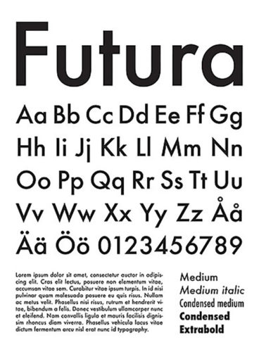
Futura is a geometric sans-serif typeface designed by Paul Renner and released in 1927.
It was designed as a contribution on the New Frankfurt-project. It is based on geometric shapes, especially the circle, similar in spirit to the Bauhaus design style of the period.
It was developed as a typeface by the Bauer Type Foundry, in competition with Ludwig & Mayer’s Erbar typeface of 1926.
Although Renner was not associated with the Bauhaus, he shared many of its idioms and believed that a modern typeface should express modern models, rather than be a revival of a previous design. Renner’s design rejected the approach of most previous sans-serif designs (now often called grotesques), which were based on the models of signpainting, condensed lettering and nineteenth-century serif typefaces, in favor of simple geometric forms: near-perfect circles, triangles and squares. It is based on strokes of near-even weight, which are low in contrast.
Futura was extensively marketed by Bauer and its American distribution arm by brochure as capturing the spirit of modernity, using the German slogan “die Schrift unserer Zeit” (“the typeface of our time”) and in English “the typeface of today and tomorrow”. It has remained popular since.
The design of Futura avoids the decorative, eliminating nonessential elements, but makes subtle departures from pure geometric designs that allow the letterforms to seem balanced.
Source: Wikipedia
